MVM
_13
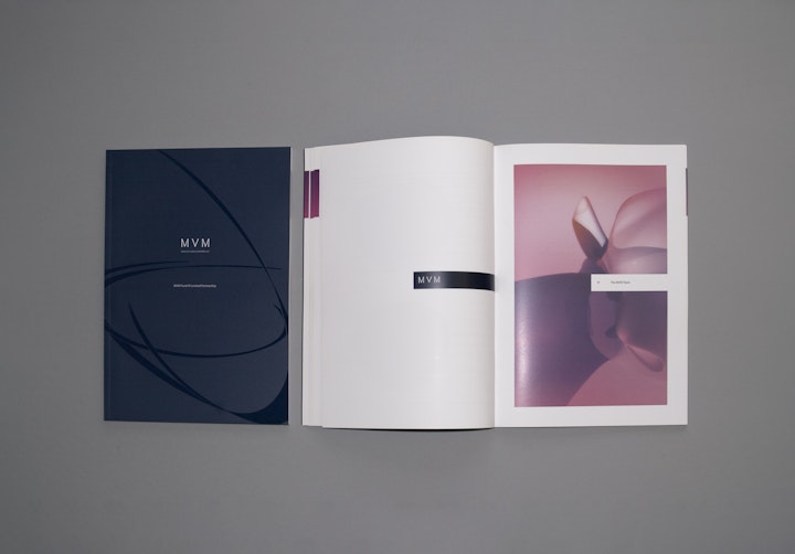
An established and vibrant venture capital firm in the technologies and life-sciences sector, MVM needed to shake their old generic identity and commit to something more sophisticated and much bolder. Moving MVM away from a guilty member of the 'just another DNA or atom logo' club, the rebrand balances a corporate look with a front more in keeping with the progressive scientific sector they represent, the full set of MVM collateral has a sophisticated and modern feel to it.
Profission created a pseudo-iconic that was used a background element around the logotype itself. Invoking a sense of movement, the iconic was a suggestion of the six degrees of freedom. The logotype borrows its methodology from engravers; the symmetrical letterforms are classic and sophisticated, spaced comfortably but with an air of austerity. Using a very dark green-blue as a base, logo and text are either rendered blue on white, or white on blue, with an omnipresent two-colour pink gradient strip that lends significance and a touch of the contemporary to the otherwise very conservative brand. The iconic appears in very low contrast as a Spot UV Varnish in printed collateral.
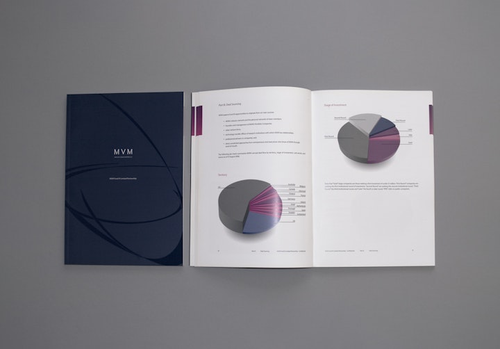
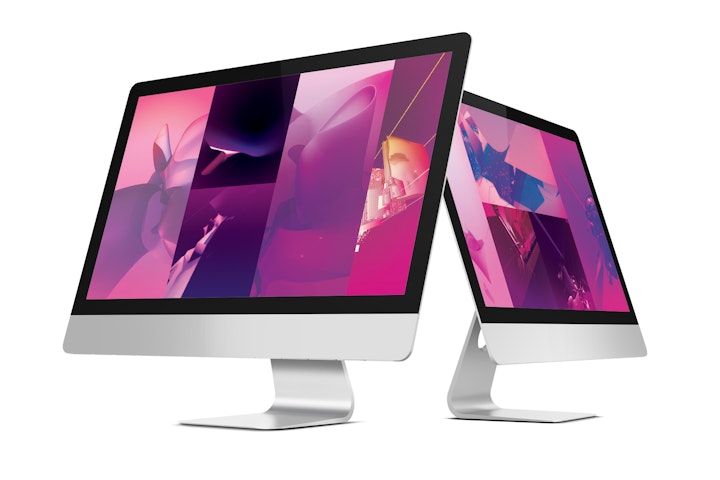
Following the stationery rollout Profission were asked to produce a 96-page fund report; adhering to the new brand, of course. The brochure uses very abstracted quasi-medical and scientific illustrations to ground the company in the present, rather than relying on historical or over-played industry metaphors. Something of a new approach, the brochure was very well received within their sector and gave MVM a launchpad with which to establish themselves against their peers.
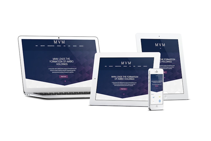
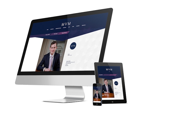
Built on Profission's Titian content management platform the final phase was a brochure site introducing the team at MVM and their portfolio of investments with case studies and news of their progress. The site also carries information for investors and entrepreneurs interested in working with MVM.
