
Quantum
_07
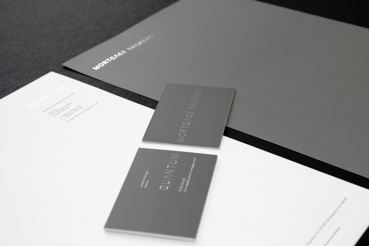
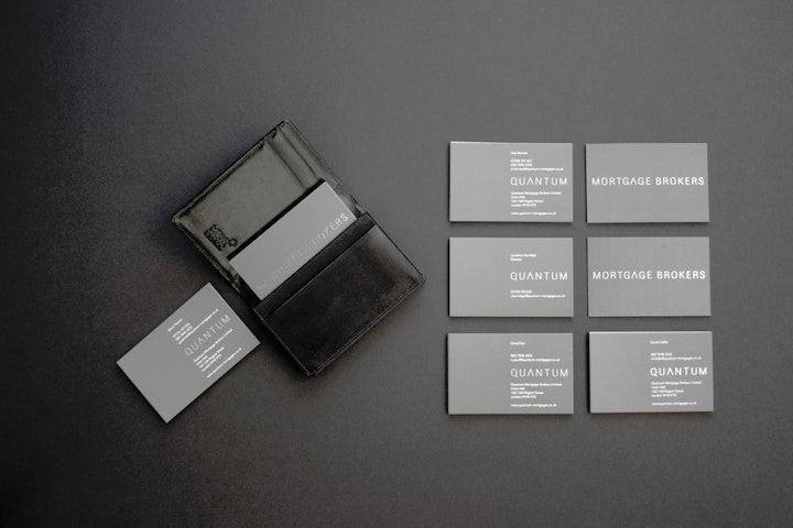
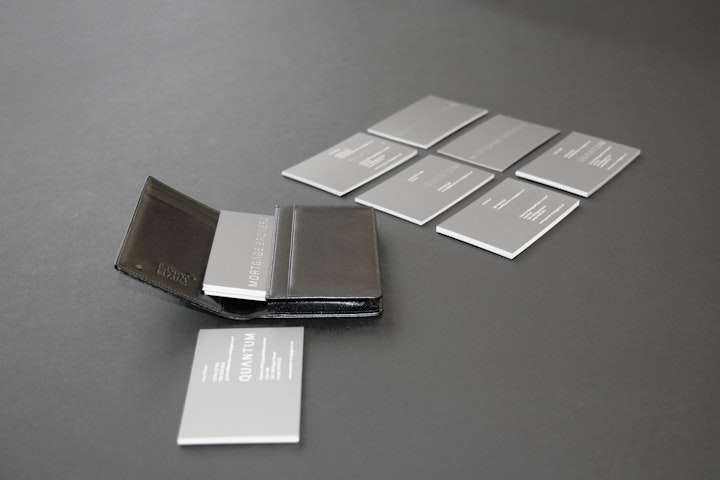
Following a series of prestigious industry awards this increasingly prolific mortgage broker approached us for a full rebrand, a website and a CRM software platform. The net aim of the exercise was to move Quantum into a higher net-worth market with more bespoke mortgage requirements, and to move away from the crowded and turbulent general private mortgage sector. The Quantum brand comes with a handshake, not a phone call, so the business card became the most important, consistent advert the company could produce.
All collateral was entirely monochrome, with bright focus colours used to pick out key marketing messages. Printed stationery featured the Quantum logotype rendered in silver foil over white or grey, with the department on the reverse. Since its release the brand became a significant cornerstone, helping the company communicate its value and stand out from its competition, garnering considerable praised within its community.
The rebrand garnered more column inches, more pixels on blogs and showcase sites, and more pages in expensive design press publications than any other project we produced at Profission. The reason was pure simplicity; Quantum were trading simplicity, calmness and re-assurance. After you've sat down with an advisor who tells you he can work out a solution to help you live in the home you want, he leaves you with this simple reminder. Remarkably uncomplicated, quietly confident, perfectly understated.
__________________________________________________
Recognition
08.04 Design&Design Book of The Year Vol 1